
Technology · Design · 2026
Lumora Health
A warm, confident identity for a telehealth brand built for people living far from home.
The situation
Lumora Health was launching a telehealth service for families who live far from home. They had no logo, no references and one firm rule: no blue. The brand had to feel professional and friendly at the same time.
What we made
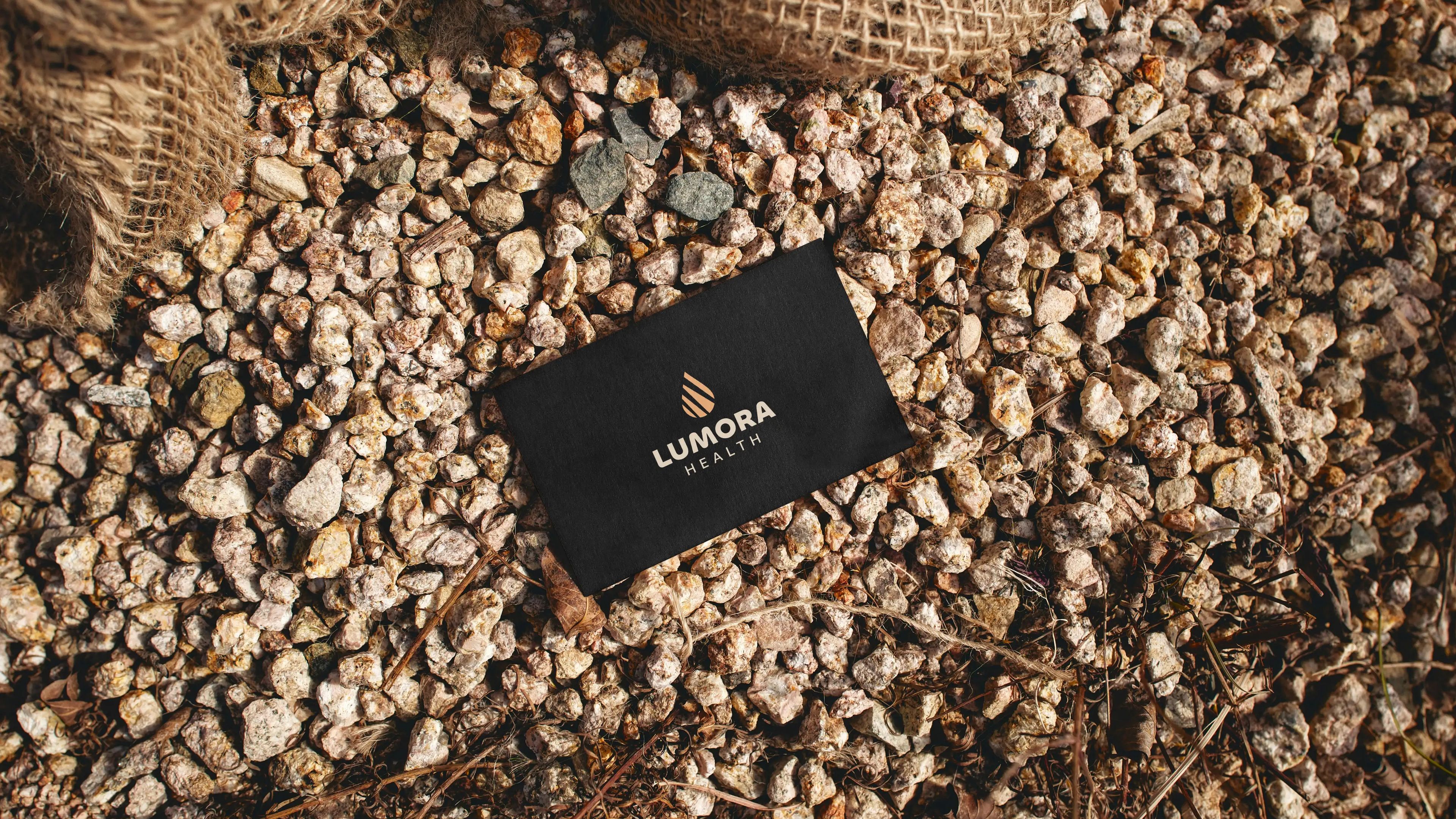
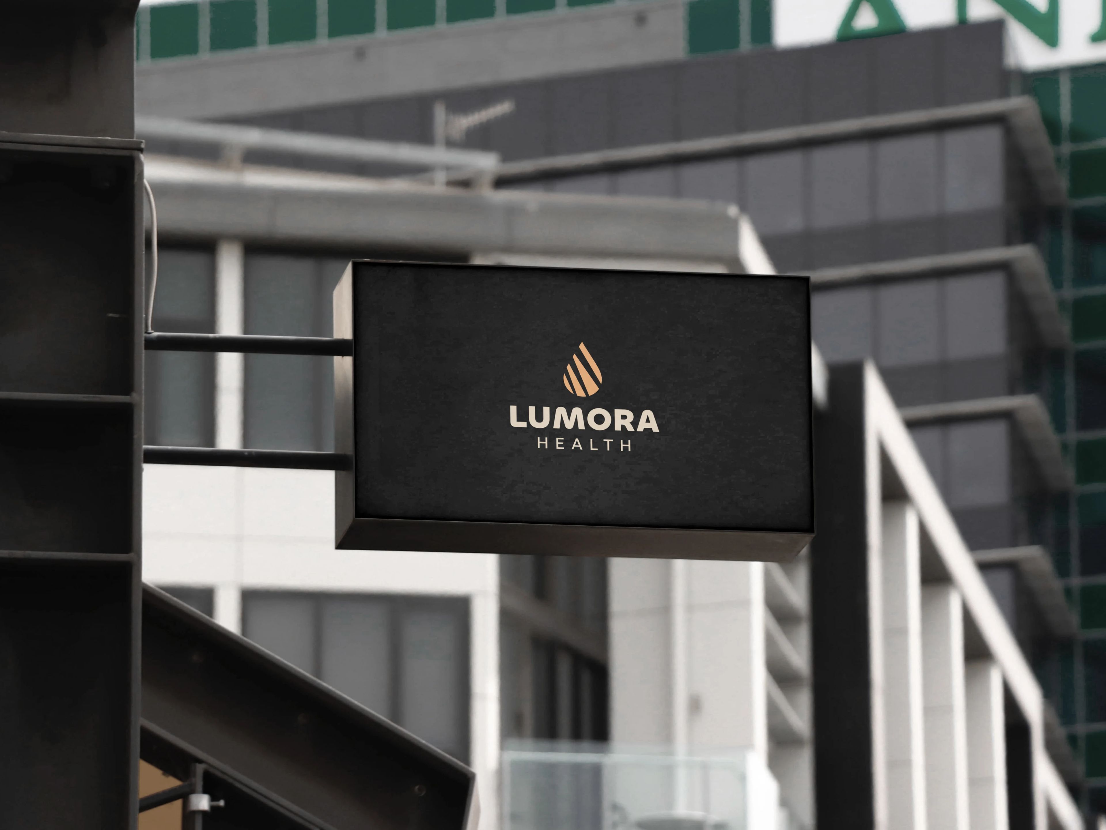
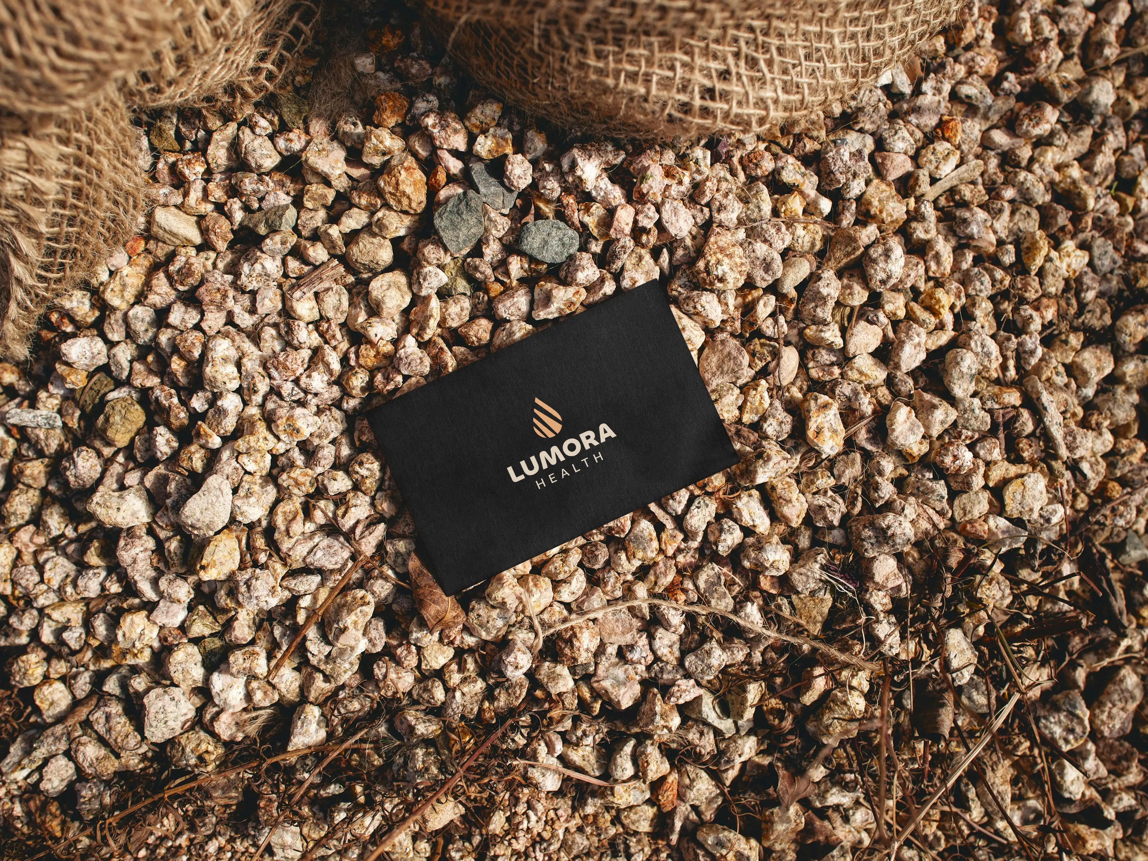
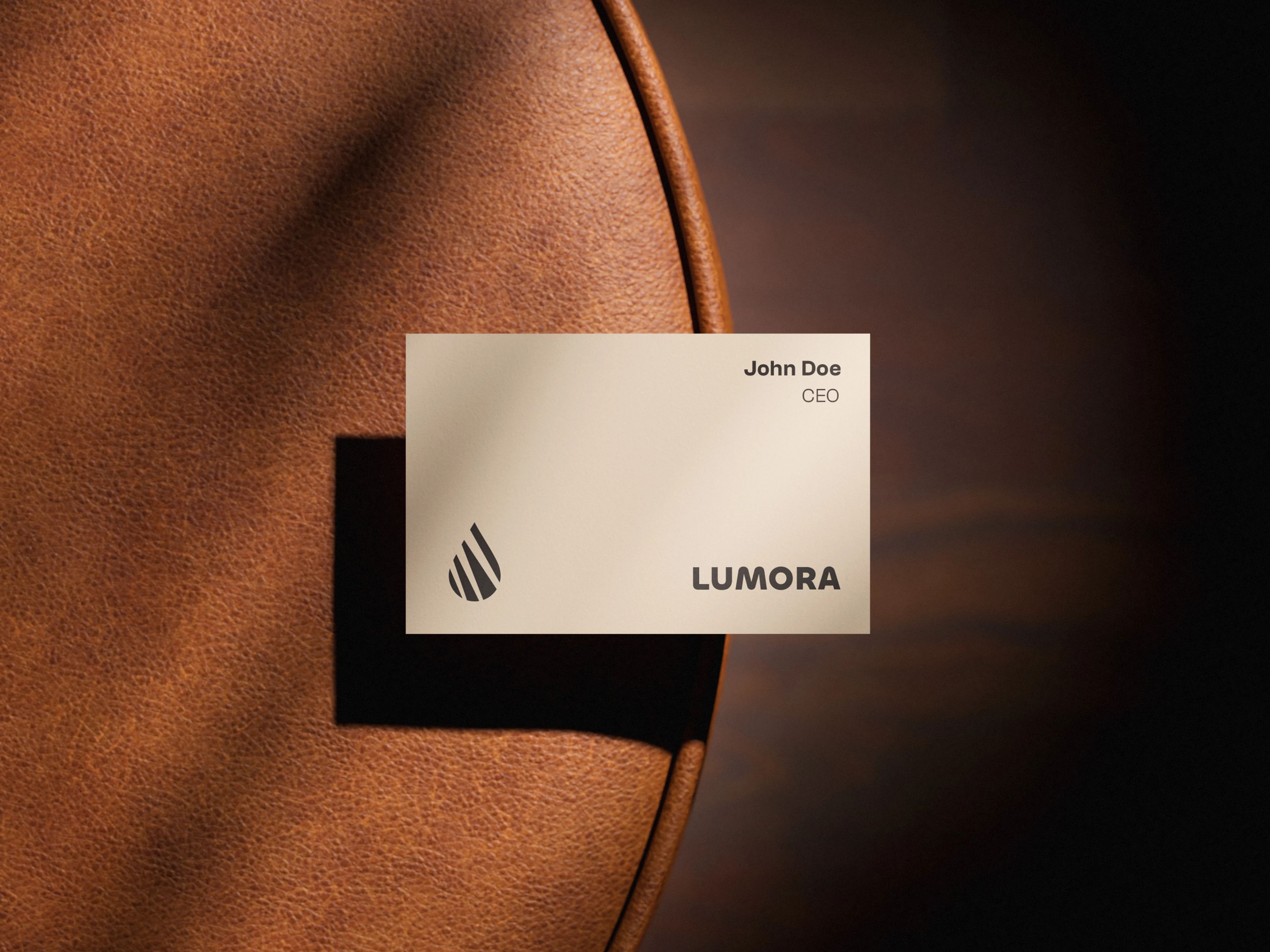
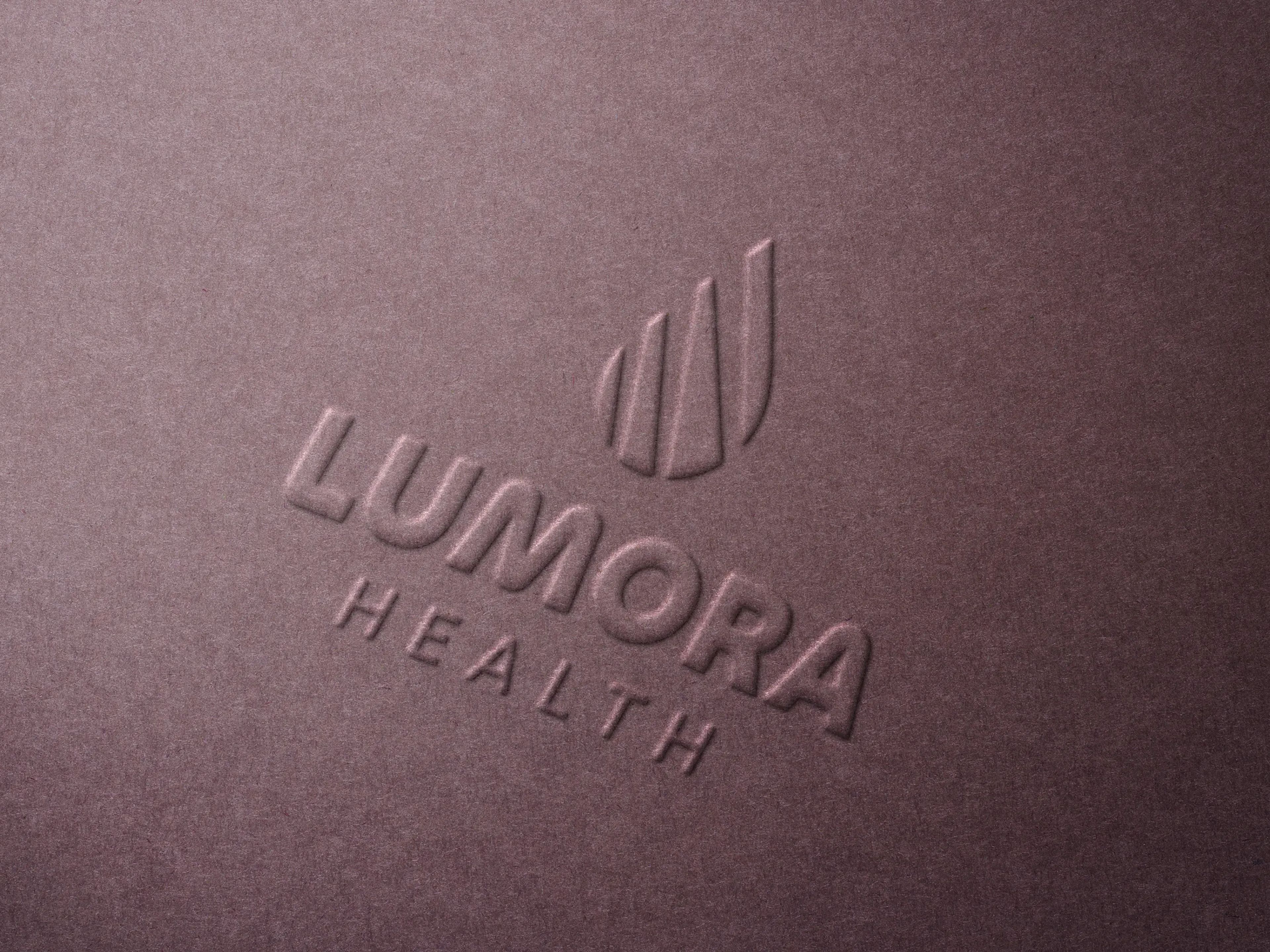
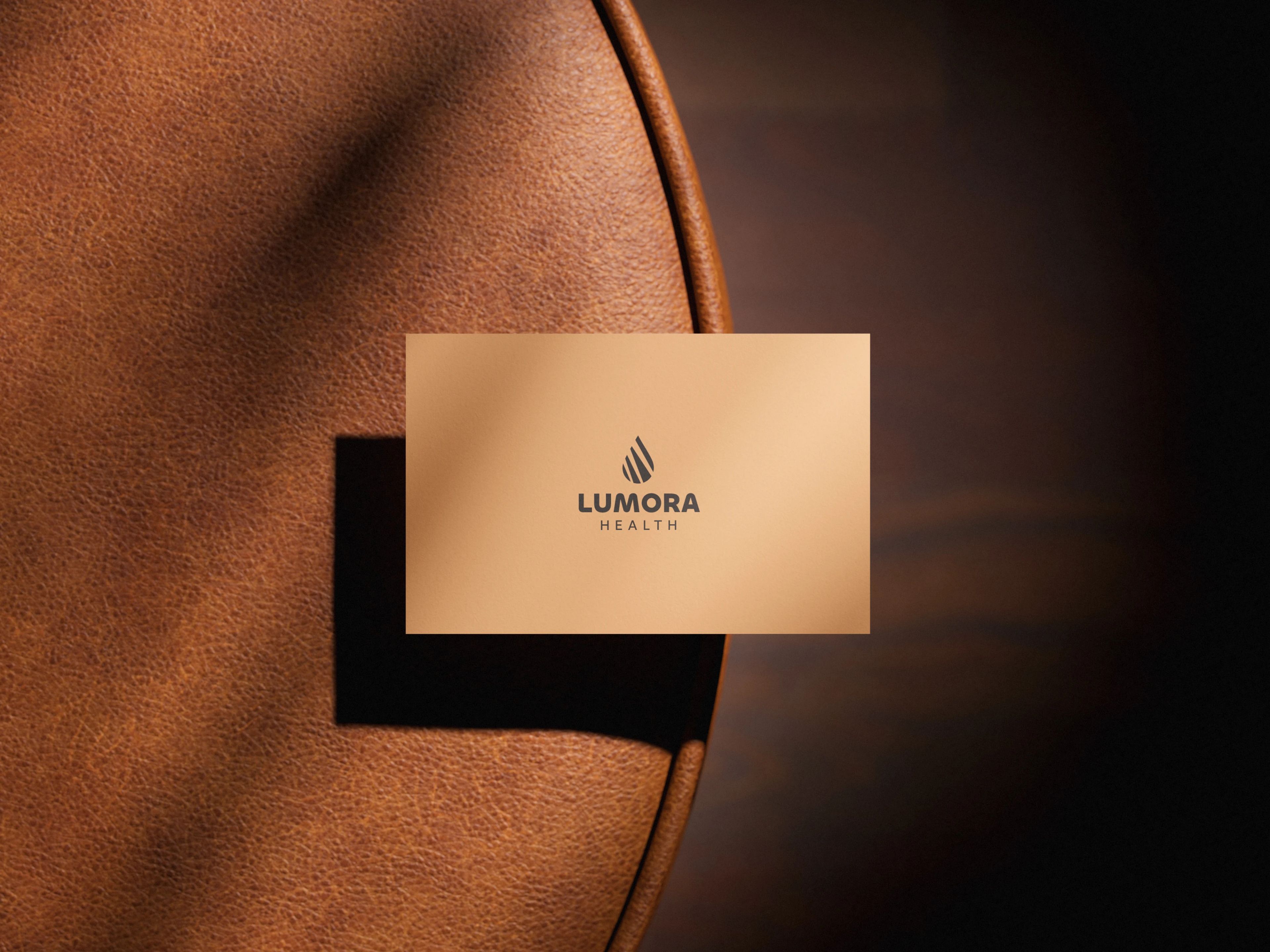
A mark we call the drop of light: rising slats inside a rounded drop, in warm amber. It sits beside a bold, rounded wordmark. The palette runs on yellow, pink and gray, and the full logo kit is ready for screen and print.
- Logo mark
- Primary and horizontal lockups,
- Digital logo kit (SVG, PNG, JPEG)
- Print logo kit (CMYK PDF)
The work
What changed
Lumora now looks like care, not a clinic. The mark holds up in one colour at any size, from an app icon to a billboard.